City of Rancho Cucamonga
- Art Direction
- Development
- Drupal
- Migration
- UX Research
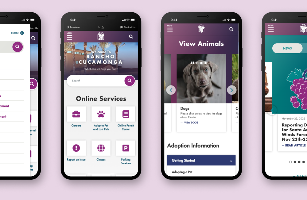
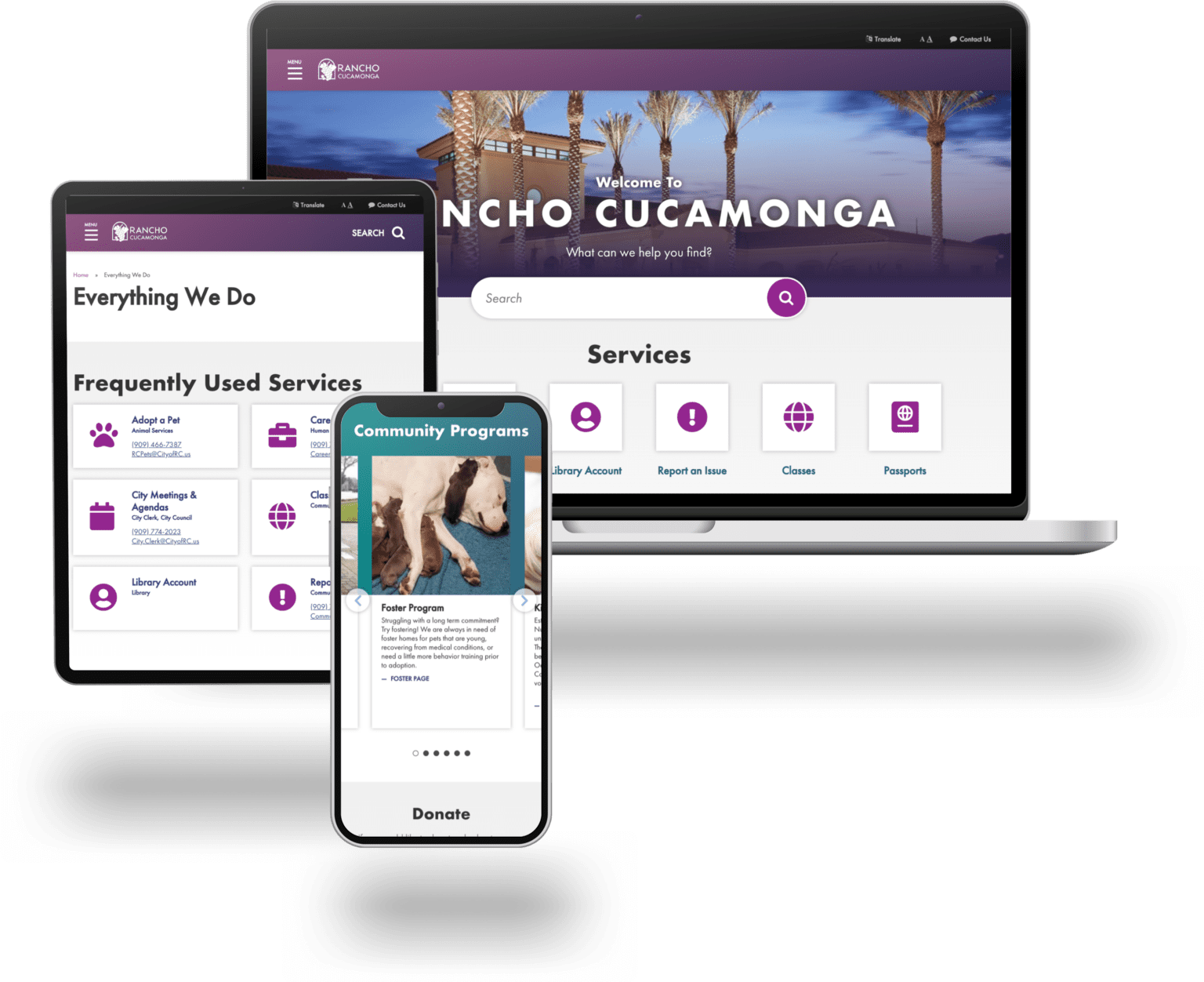
The City of Rancho Cucamonga had an outdated and confusing website. Users couldn’t find city services and information they needed. The site also didn’t work for the 65% of users who were accessing it with a mobile device. Most of all Rancho wanted to simplify and refine their site. To focus on what matters most to residents and cut out the rest.

Our Process
The main focus of this redevelopment was to simplify and restructure content. This required a detailed site analysis so the KWALL and Rancho team could decide what to keep. The site analysis also generated the sitemap and user flows.
KWALL worked with Rancho to redesign the site in a way that aligned with the city’s brand and values. We do this by identifying those values and the primary audiences visiting the site. This enables us to create a compelling experience.

A truly mobile first and citizen first website
The final site has 68% fewer pages. The result is a leaner, more efficient website. This, along with making city services more prominent, vastly improved users experience. Users can find what they came for quickly and without having to hunt around. Add in the improvements to menu structure and Rancho now has a world-class, mobile optimized site.
Related

City of Chandler Arizona
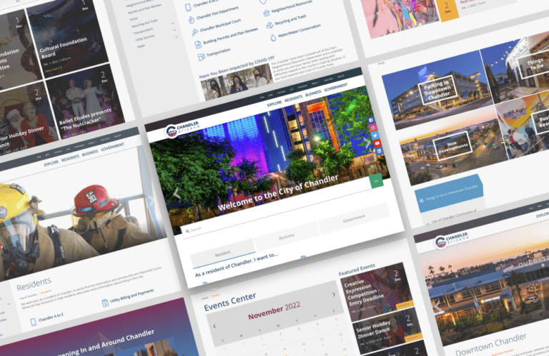
City of Chandler Arizona We knew we had to deliver a system that the nearly 250,000 residents of Chandler, Arizona would be proud of. Utilizing numerous integrations that are essential to facilitate the myriad of responsibilities that a large, influential city must execute on a daily basis, we were able to craft a website that…
