Over the past year, trust in higher education institutions has dropped significantly, with only 36% of American adults expressing “a great deal” or “quite a lot” of confidence in them. Factors like rising tuition costs, the impact of the COVID-19 pandemic, and doubts about the value of a college education have all fueled this growing skepticism. As a digital agency, we have seen this distrust in many audiences. But there is a powerful tool at your disposal to rebuild trust—your website. In fact, 75% of consumers assess a company’s credibility based on the quality of its website design. In this article you will discover the top 10 higher ed website design trends and tips in 2024.
By creating a higher ed website that’s modern, optimistic, and focused on rebuilding trust, you can strengthen your online presence and connection with your audience. At KWALL, our designers stay in tune with the challenges and demands of higher ed web design. We work closely with higher ed institutions to craft websites that better tell their stories. Drawing from our experience, we’re sharing trends and tips to ensure your website remains effective and aligned with shifting audience expectations.
Optimizing User Experience
User experience refers to how visitors interact with your institution’s website. Whether they’re browsing undergraduate majors, subscribing to your newsletter, or making a donation through your online giving form, these activities all contribute to the overall user experience.
With your website design, the goal should be to simplify and enhance the user experience, creating seamless journeys for every visitor. Each visitor should be able to find the information they need quickly and easily.
At KWALL, we’ve worked with institutions like Old Dominion University to design websites that cater to the unique needs of audiences. By focusing on easy navigation, we’ve helped Old Dominion enhance the online experience for students, donors, and alumni.
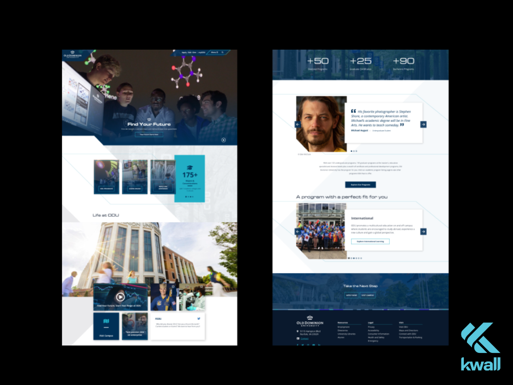
Tailoring experiences for specific user groups is becoming increasingly common as universities gain deeper insights into their target audiences. To help visitors navigate your college or university website more effectively, consider the following:
- Use concise calls to action (CTAs): Guide visitors through your site with CTAs that address their common questions and concerns.
- Simplify your navigation: Keep your website’s menu short and straightforward with a limited number of items. This keeps the navigation clean and user-friendly.
- Ensure mobile-friendliness: Your site should have a responsive design that delivers an equally positive experience across all devices.
- Provide clear next steps for each visitor segment: Offer tailored prompts that guide different users through your content. For example, Old Dominion University’s website includes intuitive pathways for students and faculty, helping each group quickly find relevant information.
Embracing AI as an Organizational Practice
With the growing accessibility of user-friendly artificial intelligence (AI) tools, students and faculty are eager to see how universities are incorporating AI into academics. According to an Inside Higher Ed survey, nearly three out of four students believe their universities should equip them for AI in the workplace, with 27% saying “a lot” and 45% saying “somewhat.”
To meet this expectation, your higher education website should showcase:
- Student use of AI: Highlight opportunities for students to engage with AI in their field through research and practical applications.
- Institutional AI policies: Include a dedicated page outlining your university’s stance on AI use.
- Research and development: Feature the latest AI-related research and news from your university’s faculty members.
Current and prospective students want assurance that your university is at the forefront of AI advancements. Make sure your AI initiatives are prominently displayed and easy to find on your website.
Expanded Resources for Underrepresented Student Communities
Higher education institutions are increasingly focusing on diversity, equity, and inclusion to ensure that all students feel supported. This effort is being recognized—over half of students surveyed in the fall of 2021 reported perceiving noticeable improvements in campus diversity.
Despite this progress, more work remains to be done. Institutions are striving to create pathways that connect students of color, LGBTQ, disabled students, first-generation college students, and other groups.
The most impactful website visuals are authentic and candid. Ensure that the photos on your university’s website accurately reflect the diversity of your student body. When prospective students see themselves represented, they’ll feel more confident and comfortable applying to your institution.
Beyond providing resources for student success, universities are increasingly clarifying their stance on diversity, equity, and inclusion (DEI) policies.
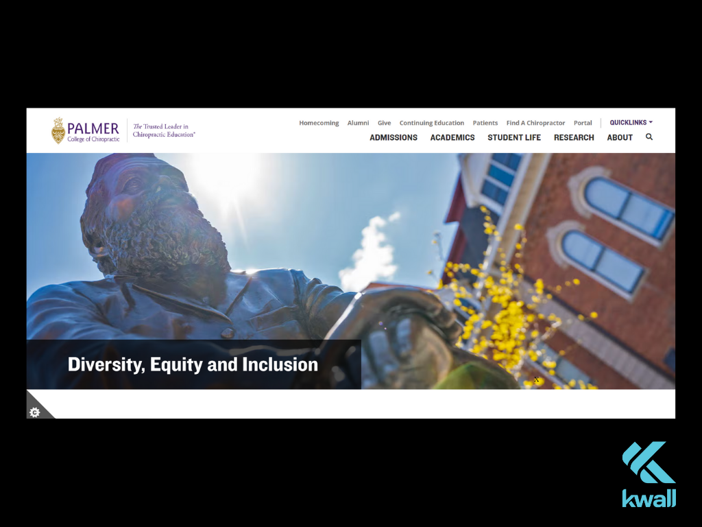
Palmer College’s Diversity & Inclusion page serves as a great example of how institutions can make their commitment to DEI visible. It outlines the school’s dedication to creating an inclusive learning environment and provides a variety of resources for underrepresented students. This approach ensures that both current and prospective students can easily find the support they need to thrive.
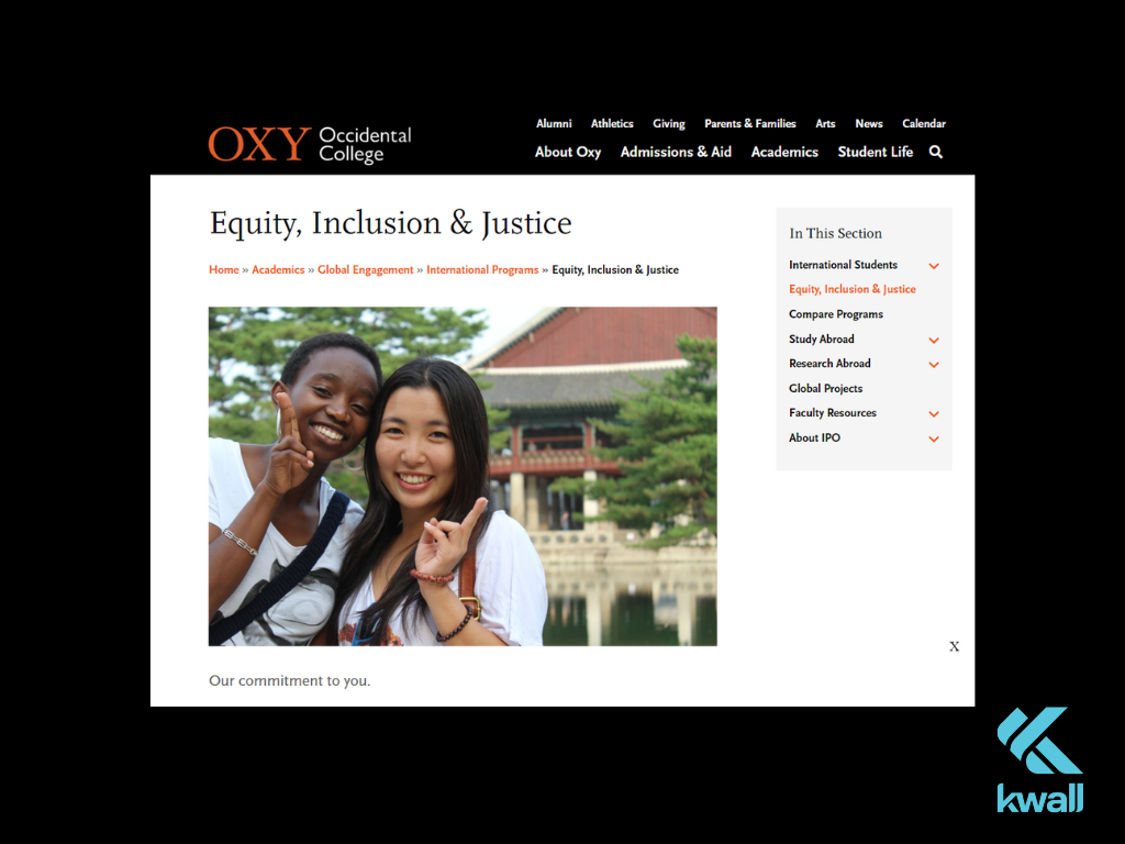
To help your university community better understand these, consider creating a dedicated webpage that outlines your DEI approach and goals. Another good example is the Occidental College’s website that features an Equity, Inclusion and Justice page with a clear framework and key definitions.
Enhanced Usability and Accessibility
A truly inclusive website is fully accessible, which means it’s designed for all users, regardless of age or ability.
Accessible university websites take into account a variety of user experiences, from color blindness to those with short-term impairments such as an injury. For instance, as website must meet key accessibility standards like color contrast and clear, descriptive alternative text for images.
To enhance your own site’s accessibility:
- Follow the Web Content Accessibility Guidelines (WCAG) to meet global accessibility standards.
- Utilize resources like KWALL’s accessibility tools to evaluate your website and pinpoint areas for improvement.
- Perform manual testing by navigating the site with only a keyboard or zooming to 200% to ensure content remains functional.
Prioritizing Mental Health and Wellness
College students’ mental health have reached crisis levels, exacerbated by financial worries and academic stress. In response, universities are putting mental health resources front and center on their websites.
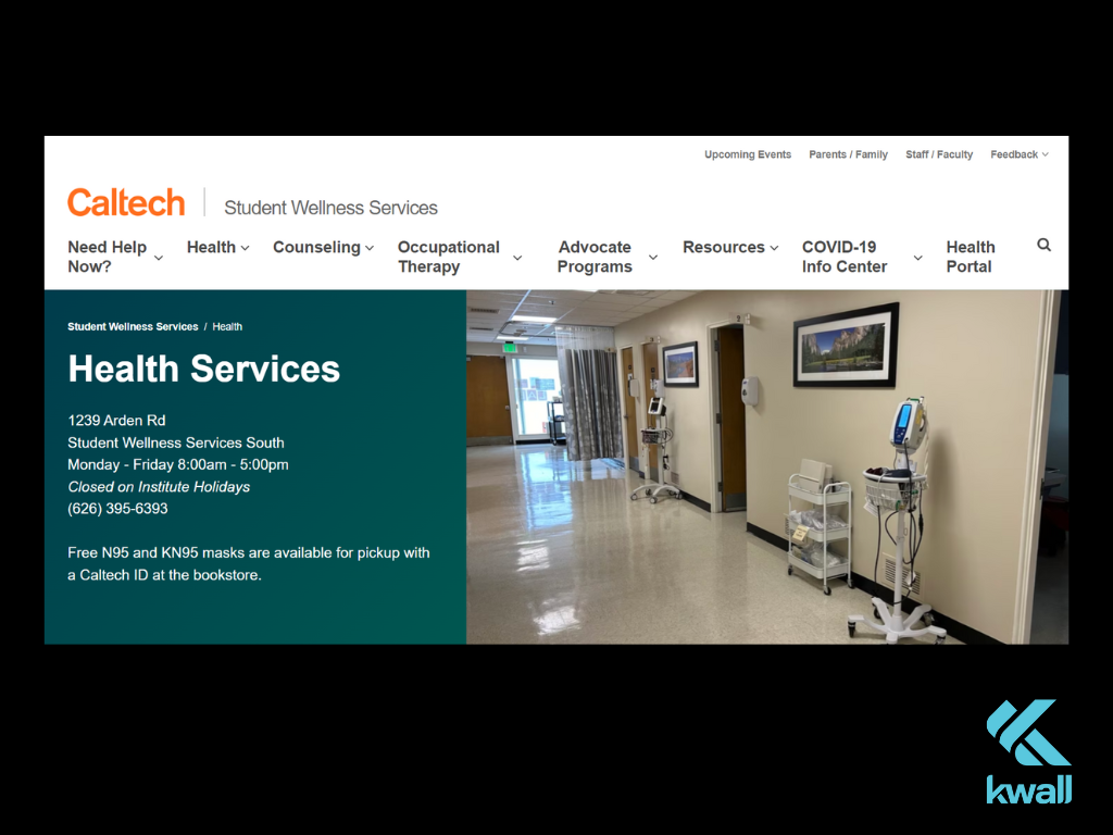
For instance, Caltech provides a comprehensive page with student wellness resources and counseling options for students, faculty, and staff. This page helps visitors find the right support tailored to their needs.
Eliminating Dark Usability Patterns
Dark usability patterns are manipulative design tactics that trick users into actions they didn’t intend to take, such as signing up for services they don’t need. These patterns take advantage of users’ trust and can lead to frustration, confusion, and a damaged relationship with your website visitors. While these deceptive practices are less common on higher education sites, it’s still important for designers to remain vigilant.
Eliminating dark usability patterns is key to creating a transparent and ethical user experience. By focusing on straightforward design and avoiding hidden motives, your website ensures that users can navigate without feeling manipulated. This builds a stronger, more positive connection between your institution and its audience, leading to better engagement and long-term satisfaction. Ultimately, a user-friendly, honest interface not only benefits your visitors but also enhances your brand’s reputation and credibility.
Microinteractions
Microinteractions are small, engaging moments on a website, such as buttons that change color or interactable infographics. These tiny details add joy and satisfaction to the user experience.
Consider the satisfaction and joy you feel when using Facebook’s reaction buttons or sending an animated message on an iPhone. These small, engaging interactions make digital experiences more enjoyable. A university’s virtual tour should be packed with microinteractions. Though microinteractions are brief, they can significantly enhance your visitors’ experience on your website. By optimizing these small moments, you ensure that every interaction users have with your site leaves a positive impression.
Real-Time Updates
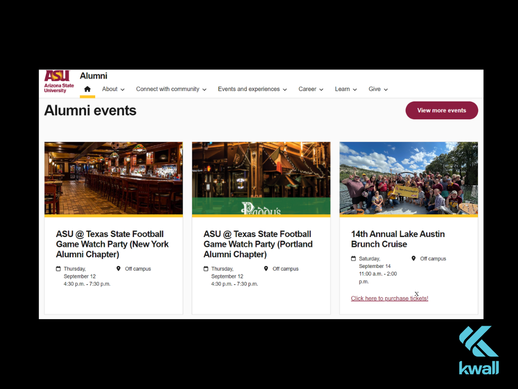
Higher education websites are increasingly serving as real-time hubs for news, research developments, and community updates. Social media feeds, blog updates, and news articles keep content fresh and relevant.
For example, ASU Alumni Association features a scrolling news feed that showcases events, research, and news. This content keeps the website current and establishes it as a valuable resource for students, alumni, and researchers.
How KWALL Can Elevate Your Higher Ed Website Design
Working with a design agency like KWALL ensures your university website remains at the forefront of user-centric trends. Our process includes:
- Research and discovery: We conduct thorough research and testing to create a strategy that aligns with your goals.
- Content strategy: We assess your existing content, focusing on tone, inclusivity, and accessibility improvements.
- User experience: We design clear pathways tailored to the needs of different audience segments.
- Website design: We deliver cutting-edge designs optimized for every user interaction.
As higher education institutions move forward, university websites are essential in fostering connection among students, faculty, alumni. By creating a welcoming and accessible online space, your website can help build a sense of community and support. Explore our higher ed design case studies and get in touch to take your website to the next level!


